Understanding the Role of Typography in User Experience
Typography plays a critical role in shaping the overall user experience of digital platforms. It goes beyond the mere arrangement and selection of fonts; it encompasses the art and science of using type to effectively communicate and engage users. From websites and mobile apps to digital advertisements and social media posts, typography significantly affects how users perceive and interact with digital content.
When appropriately applied, typography can enhance readability, establish hierarchy, and evoke emotions. A well-chosen typeface can reflect a brand’s personality and establish a visual identity that resonates with the target audience. Conversely, poorly executed typography can result in confusion, frustration, and ultimately drive users away. Therefore, understanding the principles of typography and its impact on user experience is of utmost importance for designers and marketers alike. By harnessing the power of typography, businesses can create memorable and user-friendly digital experiences that effectively communicate their message and leave a lasting impression on their audience.
Exploring the Impact of Typography on Brand Identity
Typography plays a crucial role in shaping a brand’s identity. It is the visual representation of a company’s personality and values, and can significantly impact how a brand is perceived by its target audience. The choice of fonts, spacing, and overall design can evoke emotions, convey messages, and create a memorable impression.
A well-thought-out typography strategy can help establish a brand’s uniqueness and differentiate it from its competitors. Consistency in typography across various brand touchpoints, such as the logo, website, packaging, and advertisements, creates a cohesive and professional image. When typography aligns with a brand’s mission and values, it fosters trust and credibility among consumers, leading to increased brand loyalty and recognition. Inversely, inconsistent or inappropriate typography choices can create confusion, dilute the brand’s message, and even hinder customer engagement.
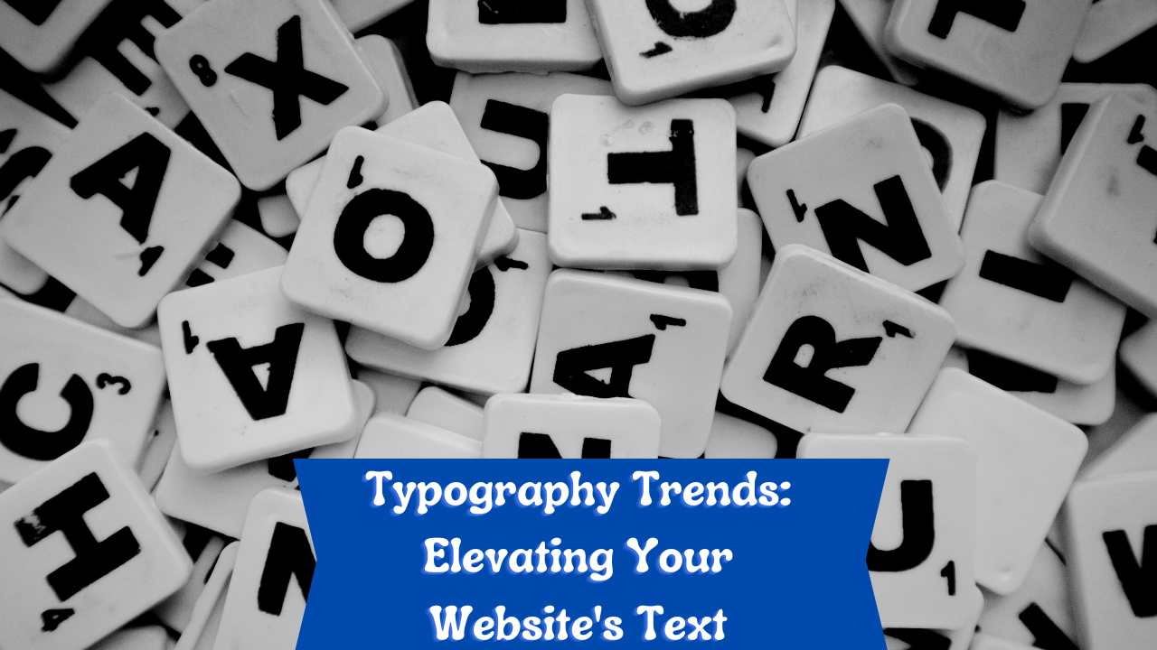
Incorporating Typography Trends to Enhance Readability
Typography plays a crucial role in enhancing readability and improving user experience on websites. By incorporating the latest typography trends, designers can ensure that the text is not only visually appealing but also easy to read and understand. One of the current trends is the use of bold and large fonts for headings and subheadings, while opting for simpler and clean fonts for body text. This contrast helps to create a hierarchy and guide users through the content effortlessly.
Another trend that can enhance readability is the use of ample white space. By giving enough space between paragraphs and lines, the text becomes more legible and less overwhelming for the reader. Additionally, designers are now utilizing responsive typography, which essentially means that the fonts are tailored to different screen sizes and devices. This ensures that the text remains readable regardless of whether it’s viewed on a desktop, tablet, or mobile phone. Overall, by staying up to date with typography trends, designers can greatly enhance the readability of websites and improve the overall user experience.
Choosing the Right Font for Your Website
When it comes to designing your website, typography plays a key role in creating a professional and visually appealing user experience. Choosing the right font for your website is essential to convey your brand identity and enhance readability.
First and foremost, it is important to select a font that aligns with your brand personality and values. Consider the emotions and associations that different fonts evoke. For example, sleek and modern fonts may be more suitable for a tech-focused website, while elegant and classic fonts might be a better fit for a luxury brand. Ensure that your font reflects the tone and message you want to communicate to your audience.
Additionally, readability should be a top priority when choosing a font for your website. Typeface, letter-spacing, and font size all contribute to the overall legibility of your content. While it may be tempting to use intricate and decorative fonts, keep in mind that they can be challenging to read, especially on mobile devices. Opt for fonts that are clear and easily distinguishable. Consider conducting user testing to determine the legibility of different fonts and make adjustments as necessary.
In conclusion, choosing the right font for your website requires careful consideration of your brand identity and readability. By selecting a font that aligns with your brand personality and is easily legible, you can create a visually appealing user experience that effectively communicates your message to your audience.
Exploring Unique Typography Styles to Stand Out
One way to make your website or brand stand out from the competition is by exploring unique typography styles. Typography plays a crucial role in creating a memorable visual identity, and using distinctive fonts can leave a lasting impression on your audience.
When it comes to selecting a typography style that sets your brand apart, there are several factors to consider. First, it is important to understand your brand’s personality and values. Are you aiming for a playful and energetic vibe, or do you prefer a more elegant and sophisticated look? Once you have a clear idea of your brand’s identity, you can choose a typography style that aligns with your vision. From retro-inspired fonts to bold and modern typefaces, there are endless possibilities to explore. Remember, the goal is to make a statement with your typography that resonates with your target audience and helps you stand out in a crowded digital landscape.
Utilizing Typography Hierarchy to Guide Users
Typography hierarchy is an essential element in guiding users through a website or any form of written communication. By effectively utilizing different levels of font size, weight, and style, designers can create a visual hierarchy that enhances readability and directs the users’ attention to the most important information.
One of the key aspects of typography hierarchy is the use of a consistent and well-structured layout. This includes establishing a clear distinction between headings, subheadings, body text, and any other relevant elements. For example, using a larger font size for headings and a smaller font size for body text helps to differentiate between different levels of information. Additionally, adjusting the font weight and style can also contribute to the overall hierarchy, allowing key points or important sections to stand out. By incorporating these design principles, designers can guide users seamlessly through the content, making it easier for them to digest and retain the information.
Enhancing Visual Appeal with Typography Pairings
Typography pairings play a crucial role in enhancing the visual appeal of any design project, whether it’s a website, logo, or print material. When used effectively, the right combination of fonts can evoke emotions, convey messages, and create a cohesive and visually engaging experience for users.
The key to successful typography pairings lies in finding the right balance between contrast and harmony. Pairing fonts that have distinct characteristics, such as a bold and modern sans-serif with a delicate and elegant script, can create a visual hierarchy and draw attention to specific elements. On the other hand, combining fonts that share similar attributes, such as proportions or character shapes, can establish a sense of unity and cohesiveness throughout the design.
By experimenting with different typography pairings, designers can create unique and visually appealing compositions that stand out from the crowd. However, it’s important to keep in mind that the chosen fonts should not only complement each other but also align with the overall brand identity and the intended message. Striking the right balance between visual appeal and readability is the key to creating typography pairings that leave a lasting impression on users.
• Typography pairings are essential for enhancing the visual appeal of design projects.
• The right combination of fonts can evoke emotions and convey messages effectively.
• Finding a balance between contrast and harmony is crucial for successful typography pairings.
• Pairing fonts with distinct characteristics can create a visual hierarchy and draw attention to specific elements.
• Combining fonts with similar attributes establishes unity and cohesiveness in the design.
• Experimenting with different typography pairings allows designers to create unique compositions.
• Chosen fonts should align with the brand identity and intended message, not just complement each other.
• Striking a balance between visual appeal and readability is key for lasting impressions on users.
Optimizing Typography for Different Devices and Screen Sizes
When it comes to optimizing typography for different devices and screen sizes, there are a few key considerations that need to be taken into account. One of the most important factors is maintaining readability across all screen sizes. The fonts used should be legible, with a good contrast between the text and the background. It is also important to ensure that the font size is appropriate for the device being used, as text that is too small or too large can be difficult to read and may discourage users from engaging with the content.
Another factor to consider is the responsiveness of the typography. With the prevalence of mobile devices and the varying screen sizes they come in, it is crucial to ensure that the typography adjusts seamlessly to different devices. This can be achieved by using responsive typography techniques, such as using relative units like percentages or ems for font sizes instead of fixed pixels. Additionally, utilizing media queries and breakpoints can help tailor the typography to specific screen sizes, ensuring an optimal reading experience for users across all devices.
Future Typography Trends: What to Expect and Prepare for
Paragraph 1:
As the digital landscape continues to evolve, typography trends play a crucial role in keeping websites and user interfaces visually appealing and engaging. Moving forward, one of the key typography trends to expect is the rise of variable fonts. Unlike traditional fonts that offer limited variations, variable fonts bring flexibility by allowing designers to manipulate the weight, width, and even optical size of a font. This not only provides greater creative freedom but also enables websites to optimize typographic elements for different screen sizes and devices, ensuring a seamless user experience.
Paragraph 2:
Another typography trend that is expected to gain momentum is the use of experimental and unique typography styles. Designers are increasingly pushing boundaries by exploring unconventional typefaces and layouts to create a distinctive visual identity. Whether it’s using bold and striking fonts or incorporating hand-drawn lettering, these unique typography styles can help websites stand out in a sea of digital content. However, it is essential to strike a balance between creativity and readability, ensuring that the chosen typography style enhances the message without sacrificing legibility. So, as we prepare for the future of typography, embracing these trends while staying true to the fundamental principles of design will be key to creating captivating and user-friendly digital experiences.
What role does typography play in user experience?
Typography plays a crucial role in user experience as it affects readability, legibility, and overall visual appeal of a website or design. It helps convey information and guide users through content.
How does typography impact brand identity?
Typography plays a significant role in shaping brand identity. Different font styles, sizes, and pairings can convey different emotions and characteristics, helping to establish a brand’s personality and make it memorable.
How can incorporating typography trends enhance readability?
By keeping up with typography trends, designers can ensure their content is visually appealing and easy to read. Trends like larger font sizes, bold typography, and ample spacing can significantly improve readability.
How do I choose the right font for my website?
When choosing a font for your website, consider factors such as readability, legibility, brand personality, and target audience. Test different fonts and see how they align with your website’s content and overall design.
How can I make my typography stand out and be unique?
Exploring unique typography styles, such as custom fonts or experimental letterforms, can help your typography stand out. Consider blending different font styles or creating custom typography to create a distinctive visual identity.
What is typography hierarchy and how can it guide users?
Typography hierarchy refers to the arrangement and organization of different font sizes, weights, and styles to guide users through content. By using hierarchy effectively, designers can highlight important information and create a clear visual hierarchy for users to follow.
How can I enhance visual appeal through typography pairings?
Pairing complementary fonts can create visual interest and enhance the overall aesthetics of a design. Pay attention to contrast, balance, and coherence between fonts to create harmonious and visually appealing typography pairings.
How can I optimize typography for different devices and screen sizes?
Optimizing typography for different devices and screen sizes involves ensuring legibility and readability across various platforms. Consider responsive design principles, font scaling, and appropriate line lengths to ensure a consistent and enjoyable reading experience.
What typography trends should I expect in the future?
The future of typography trends is constantly evolving, but some potential trends to expect may include augmented reality typography, variable fonts, experimental letterforms, and even more emphasis on accessibility and inclusivity. Stay updated with design communities to keep track of emerging trends.